Last year, we dedicated an article that would help beginners learn about assistive technology and how to reach out to the disabled by creating accessible PDFs. Basically, this article shows you the basics of understanding how an ordinary PDF can become ready for assistive technology software. (Read more: How to create PDF with accessibility features) But if your niche involves those in need of assistance and you really want to get into the deep with accessibility, then this article is for you as we are about to elaborate further on what it takes for a PDF to be compliant to assistive tech and section 508 accessibility.
What are the standards?
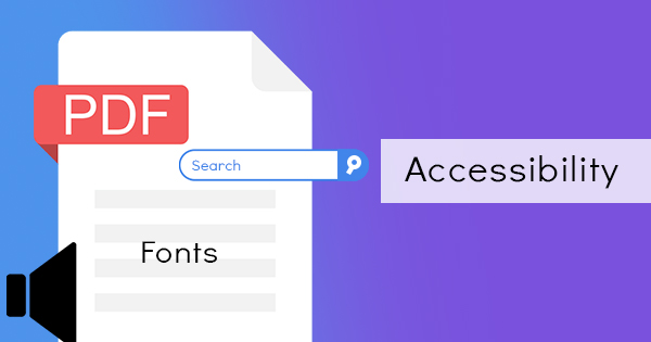
1. PDF should be Searchable. The content’s characters should be machine-readable and not scanned or image-only. Authors should keep in mind that scanned files, though containing characters visually, will be read by assistive technology as a graphic representation instead of letters and numbers. Scanned documents cannot be edited, searched, select, copy or manipulate content and therefore cannot be read by assisting software. It needs to be converted using OCR tools.

2. Fonts should be simple and should be easy for readers to map. When a reader or software cannot map the font to Unicode characters due to lack of information in the font, (being an unrecognized font) then the software will not be able to read it for the user.

3. Interactive form fields with labels and error messages should be in place. Forms need to show identification, prevent users from making errors on the form, and present tips on form completion. Interactive form fields are elements where readers can input their answers even without a PDF editor. For it to be accessible, it needs to have a defined tab order – meaning the user can click TAB to jump from one form field to another. It also needs to be labeled so that the user will be able to identify what they are filling out.

4. PDFs should have navigation. Table of contents or bookmarks is the most helpful addition as it helps users navigate through the whole document using a keyboard. Links and headings also assist users and help them identify sections or parts of the content. Having everything consistently identified is important. This saves them time and allows them to jump from one topic to another within the document.

5. Language should be indicated. Authors can set the language in PDF documents. By doing so, screen readers or speech synthesizers will be able to read the content correctly in whatever language and pronunciation are required.

6. No encryption required. Or at least allow copying, converting, or extracting to be performed on the document. If an author restricts access to the PDF file, a problem may possibly arise from their screen reader and may not be able to access, convert the content to braille or read it for the impaired.

7. It should have tags. PDF documents should have tags as tags help structure the document. With tags, the reading order can be properly executed by the assistive software. How do tags do that? Tags help identify parts such as headings, paragraphs, or tables.

8. Images, graphics, and media should have alternate text. Alternate text are short lines of description added to the image inserted on the document. It defines, describes, and replaces the media when the assistive technology “reads” it. Authors must also avoid including images of text and using text alone.

9. Visual presentation of the content needs to be simplified. It must not be reliant on color - meaning the readers will still be able to understand the document even if the color is changed or turned grayscale. It also needs to be in the right contrast for clarity and blinking or flashing objects should be avoided. This is a rule that is implemented for the cognitively challenged and the color blind.
10. If there is audio or video, controls should be present and easy to navigate. Remember, not all readers can just use a mouse to click pause.